

Mobile SEO Best Practices: 7 Best tips to Boost your Business
In 2014, Google initiated its emphasis on mobile SEO, a pivotal moment as many websites lacked mobile-friendly versions, resulting in a cumbersome browsing experience.
In the present day, mobile SEO stands as a cornerstone in any effective SEO strategy.
Explore the significance of mobile SEO, delve into optimizing your website for optimal mobile performance, and assess the results. This comprehensive guide will equip you with a profound comprehension of mobile site optimization, outlining the essential steps to render your site accessible to mobile users.

What exactly is mobile SEO?

This encompasses a spectrum of best practices, spanning from enhancing page speed and optimizing metadata for mobile users to minimizing popups and implementing mobile-friendly sitemaps.
The primary objective of mobile SEO is to facilitate easy access to SEO-friendly blogs, images, and videos for individuals using smartphones, tablets, or any device other than a desktop. Mobile SEO best practices also ensure that your site’s user interface and navigation are tailored to accommodate the preferences of mobile users.
Why Mobile SEO best practices are so important?

Discover the compelling reasons to prioritize mobile optimization with these key insights.
In essence, it’s a matter of market dynamics. Mobile searches have surpassed desktop searches for a considerable period, and this trend is poised to persist.
The implication is that a substantial portion of your potential customers rely on mobile devices for content discovery. Elevating your mobile SEO ensures seamless access to your content for these users.
Furthermore, Google has transitioned to a mobile-first index, meaning it assesses a web page’s mobile content to determine its search engine ranking. Neglecting mobile SEO puts your content at risk of lower rankings. As a result, puts your SEO visibility at risk.
Mobile is a driving force behind presale searches, as indicated by Google’s research:
Given that potential customers are actively searching for products, optimizing mobile SEO ensures that your site appears prominently in relevant searches. Notably, 93% of individuals prefer completing the entire shopping process, from product research to purchase, on mobile devices. Prioritizing mobile search optimization not only connects you with your customers but also enhances the overall user experience.
Mobile optimization plays a crucial role in future-proofing your SEO strategy, aligning with the surging popularity of voice search. Voice search extends beyond smartphones and tablets to include home assistant devices like Amazon’s Echo.
Optimizing content for voice search through mobile SEO can offer a competitive advantage, especially considering that 62% of businesses have yet to embrace this practice.
While not all businesses experience high mobile traffic, assessing your traffic patterns will guide your approach. While the inevitability of addressing mobile SEO looms, understanding your traffic dynamics will determine whether you should have acted yesterday or if a strategic rollout in the coming weeks is feasible.
Skyrocket Rankings with Mobile SEO Best Practices

Ready to optimize your blog or website for mobile? Explore 7 crucial mobile SEO tips that can significantly elevate your rankings.
The affirmation of the mobile-first index underscores Google’s prioritization of mobile-friendly websites, a logical choice given the predominant occurrence of searches on mobile devices.
To boost rankings and conversion rates, delivering a seamless experience on both mobile and desktop platforms is essential.
1. Check for mobile SEO friendliness
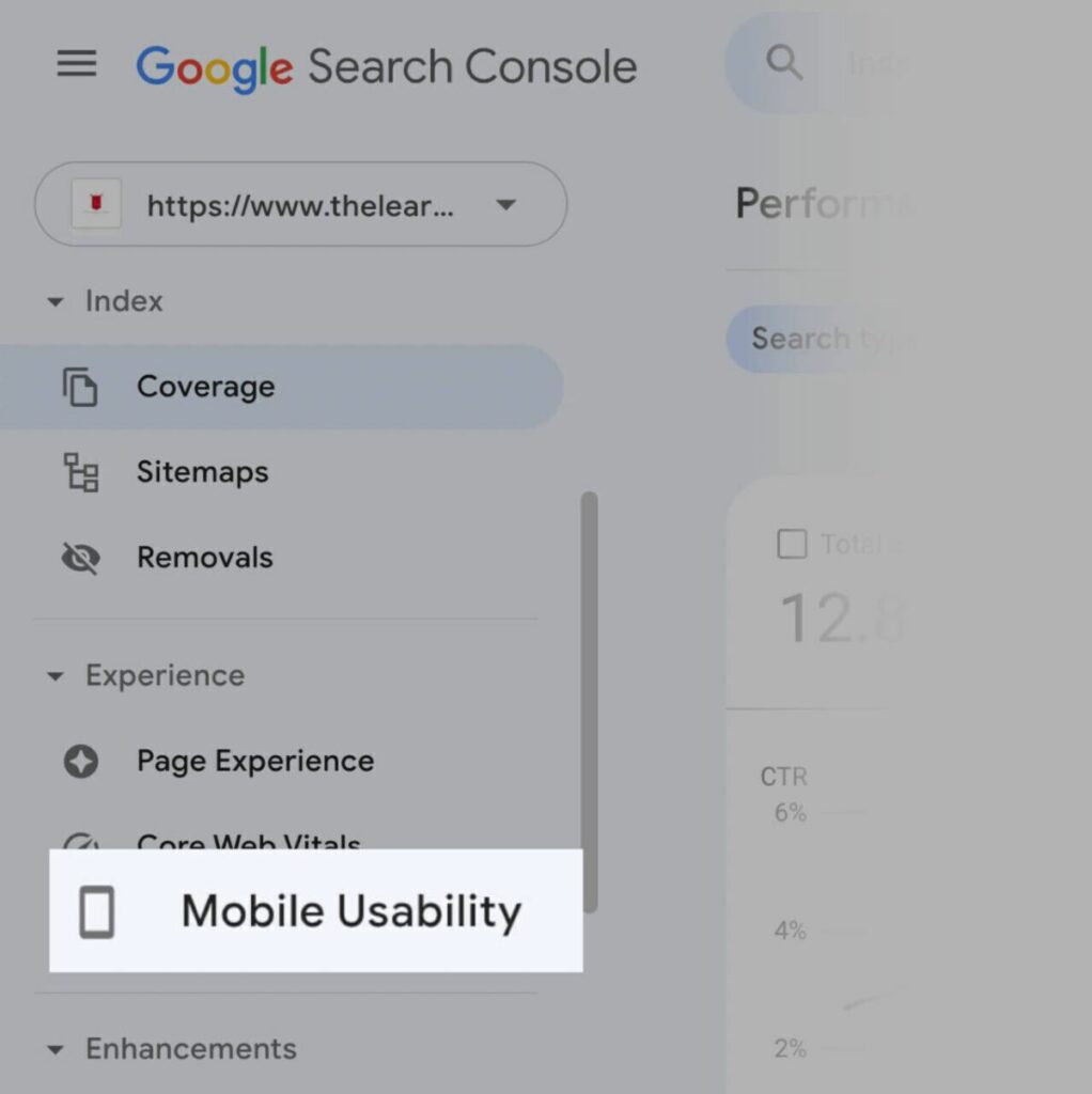
Verify Mobile Friendliness Utilize Google’s tools, such as the mobile-friendly test, to confirm the mobile-friendliness of your site. Simply input your URL and click “search” to receive a comprehensive report on your site’s mobile compatibility.
Leverage the Google Console to identify crawl errors, crucial for search engine indexing. If crawling is hindered, your content may not appear on the search engine result pages (SERPs).
Maintain consistency across mobile and desktop content to ensure a uniform user experience. This involves making all content formats—videos, images, and text—both crawlable and indexable.
Google has developed a nuanced approach to facilitate image searches by implementing relevant badges that categorize images, significantly enhancing the user’s ability to navigate and make discoveries within their search results. This system enables searchers to efficiently find images related to shopping, recipes, and much more, streamlining the process of locating the exact type of visual content they’re seeking.
Moreover, the strategic use of alt attributes for images plays a crucial role in amplifying their relevance, especially for mobile users. Alt attributes, also known as alt tags or alt descriptions, provide textual alternatives to images, offering context and improving accessibility. For mobile users, who may rely on screen readers or have limited bandwidth, alt attributes ensure that the content remains comprehensible and engaging, thereby optimizing the user experience across various devices and connection speeds.
In addition to these strategies, the optimization of your content for voice search has emerged as a critical component of mobile SEO. With the advent of virtual assistants like Google Assistant, Siri, and Amazon Alexa, voice searches are becoming increasingly common, often yielding different results than traditional text searches. To stay competitive and visible in this evolving landscape, it’s imperative to adapt your content strategy to include conversational phrases and questions that users are likely to use when speaking rather than typing. Incorporating long-tail keywords, crafting content that directly answers common queries, and ensuring your site’s local SEO is up to par are essential tactics for optimizing for voice search.
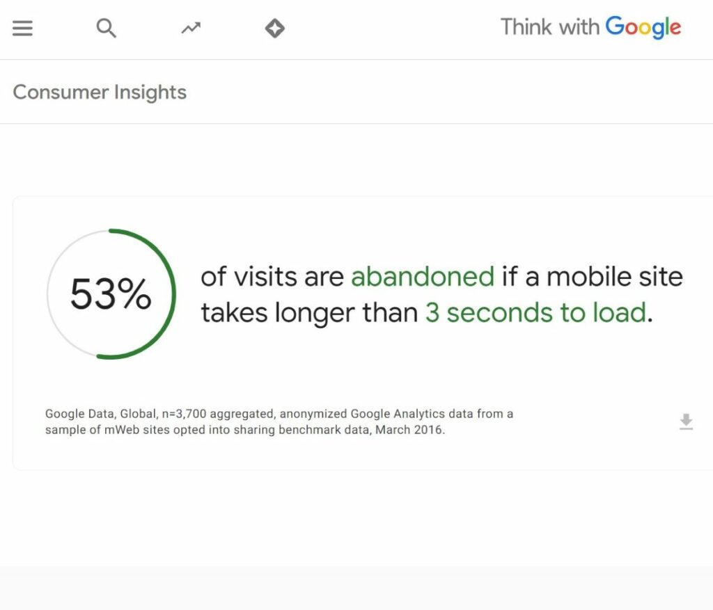
2. Increase Page Speed

Enhancing page speed is a pivotal aspect of mobile SEO optimization. A staggering 53% of mobile users, on average, will bounce off a site if it takes more than 3 seconds to load. Therefore, implementing best practices for improving page speed in SEO is crucial.
The primary focus should be on image optimization, as large images can significantly impede site speed. Utilizing an image optimization plugin can be instrumental in addressing this concern.
Another effective strategy is to host videos on platforms like YouTube or Vimeo instead of embedding them directly on your site. Site speed is notably influenced by self-hosted videos.
Additionally, creating accelerated mobile pages (AMP) is highly recommended. Leveraging Google’s AMP plugin facilitates the acceleration of your website, delivering content swiftly to mobile users.
Conducting load testing using tools such as GTmetrix is valuable in assessing and refining page speed load times. This analysis aids in identifying necessary steps to reduce load times effectively.
As a bonus tip, employing a database optimization plugin is advantageous. This tool assists in decluttering your website’s database by eliminating unwanted, unused, and unnecessary elements that may be contributing to sluggish site performance.
Implementing these strategies collectively ensures a streamlined and optimized mobile experience for users.
Mobile page speed key tips

Implementing the best practices to enhance page speed is essential for effective mobile SEO:
3. Create best mobile UX

Optimizing your mobile SEO strategy involves acknowledging the distinct ways mobile users interact with their devices and content. Consider these three fundamental aspects of mobile user experience (UX) to ensure success:
Content Readability:
Ensure your mobile-optimized website allows users to immediately engage with content without the need to zoom, scroll, or squint. To achieve this:Set a font size of at least 16px for responsive websites.
Non-intrusive Pop-ups:
While pop-ups may be divisive, they can be effective when used appropriately. Adhere to Google’s guidelines for interstitials and banners, especially on mobile websites. If employing pop-ups for cookie consent, log-in, or banners:
Element Size and Placement:
Thoughtful placement of elements is critical for seamless mobile on-page interaction. Pay particular attention to buttons to avoid user frustration:
4. Optimize for local search

A crucial aspect of mobile SEO is local SEO, especially as mobile searches featuring the phrase “near me” have tripled in recent years. This surge indicates a growing trend among users actively seeking local businesses.
Users commonly employ phrases like “near me,” “open now,” and “where can I buy” when conducting mobile searches to discover nearby businesses. Given the prevalence of such local-centric searches, it becomes imperative to tailor your strategy to effectively connect with these users.
One effective way to align with local searches is by incorporating local keywords. For instance, using a keyword like “Electronics shop in New York ” exemplifies a potent local keyword.
Individuals searching for a local flower shop are likely to use phrases such as “electronics shop in [city]” to locate one.
5. Optimize video and animated content

Ensuring a seamless user experience and robust mobile SEO requires careful optimization of video and animated content. The last thing you want is for mobile users to encounter broken videos or empty spaces instead of engaging animations.
To guarantee compatibility across all devices and browsers, it is crucial to embed any animated or video content in HTML5 format. HTML5 is optimized to function seamlessly on various devices and browsers, offering a consistent experience.
On the other hand, utilizing alternative software, like Flash, to display video content may result in malfunctions on mobile devices, leading to broken links and diminished mobile rankings.
Adopting HTML5 for your video and animated content emerges as a best practice, ensuring a smooth user experience and bolstering your mobile SEO performance.
6. Choose mobile Seo friendly WordPress theme

A mobile-friendly WordPress theme is vital for Mobile SEO best practices because it ensures optimal user experience on mobile devices. It enables responsive design, faster page loading, and adapts to various screen sizes, all of which contribute to higher search engine rankings and better accessibility for mobile users.
Why choose the best SEO-friendly WordPress theme?
7. Rectify Technical Glitches for Optimal Mobile SEO

Even the slightest glitch becomes glaring on a small screen, including the notorious 404 errors that can disrupt the user experience. While a creatively designed 404 page may offer some amusement, the fact remains—an error remains an impediment. It’s prudent to eliminate them entirely as a contributing factor.
In the realm of mobile SEO, optimizing your site for any device demands a meticulous approach to identifying and addressing technical errors. Various issues, such as broken links, malfunctioning images, undesirable page redirects, flawed CSS and Javascript, and server-related problems like gateway timeouts, can potentially drive users away if not promptly resolved.
Initiate the process by conducting a thorough examination of your site’s technical aspects. Utilize tools like WebCEO’s Technical Audit tool to scan and generate a comprehensive report highlighting potential errors.
Once identified, promptly address and rectify all website errors to ensure a seamless user experience. Don’t be deterred by technical codes like “Status: 503″—seek guidance from expert tips to navigate and resolve them effectively.
Establish a routine of regularly scanning your site, with a weekly frequency being adequate, and promptly attend to any errors that may arise. This proactive approach to technical maintenance is integral to sustaining an optimized mobile SEO strategy.
Sum
In the pursuit of reaching a diverse audience consistently and irrespective of their location, your small business must adapt to the evolving landscape of digital interactions.
Although desktop devices remain prevalent for browsing, the steady rise in mobile device usage for research, connection, and purchases emphasizes the critical importance of optimizing your mobile SEO for sustained growth and success.
To propel your business toward the zenith of search engine results, it’s essential to integrate proven desktop SEO best practices. Moreover, infusing additional components tailored to enhance the mobile experience becomes paramount.
This comprehensive approach ensures that your business is not only quickly discoverable by search engines but also positioned prominently at the pinnacle of the Search Engine Results Pages (SERPs). Embracing these mobile SEO best practices fortifies your business’s digital presence and maximizes its potential for success.